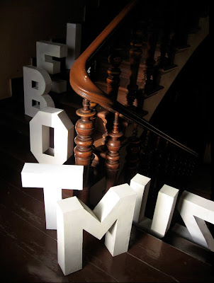
Emille Rigaud's environmental typography is an inspiration for the Beauty in the Ordinary project. Excellent photography is vital here and really makes the difference, readability has really been explored here, testing ways your eyes move across the page by reading the different stuated characters together as a word.
Jack Featherstone has worked with type in the environment, his work for 'play alphabet' is well contextualized as the naturalistic environment serves as a good contrast against the bright, colourful contemporary character.
Subscribe to:
Post Comments (Atom)


No comments:
Post a Comment