Tuesday 15 December 2009

The Ten Commandments of Typography

The Ten Commandments of Typography - Paul Felton


I have taken great inspiration from this book. It delivers, in a clear and fun way, an impressive understanding of using type for design. The simplicity of the idea and religious styling is what makes this book an original type design guide. 
The subtle use of calligraphic lettering, parchment stock and hidden crucifix throughout strengthen the quality of the book, it is very well designed.



Thursday 3 December 2009

Beauty in the Ordinary - Leeds Art Publication

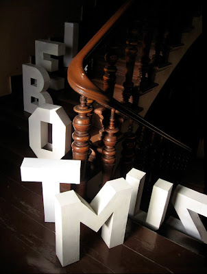
Emille Rigaud's environmental typography is an inspiration for the Beauty in the Ordinary project. Excellent photography is vital here and really makes the difference, readability has really been explored here, testing ways your eyes move across the page by reading the different stuated characters together as a word.


Jack Featherstone has worked with type in the environment, his work for 'play alphabet' is well contextualized as the naturalistic environment serves as a good contrast against the bright, colourful contemporary character.


Akatre

Website design from Akatre.
I admire the visual quality and appealing design of Akatre's websites, they help to quieten the amount of terribly designed websites. Looking at their designs, i can see a few running qualities throughout; keeping things as simple as possible but still with use of interesting imagery, also the use of strong photography against custom typefaces is a good method to create an original webpage.


Akatre's work with type and layout is also impressive. From colour to stock, composition and final photography: all is new and original. 


Beauty in the Ordinary - Leeds Art Publication

Corriette Schoenarets

Are a Design fimr which specialise in environmental typography. There displays are impressive, often working on a large scale to convey a message, Their use of objects as type is something i'd like to further continue in the Beauty in the Ordinary booklet.


Akatre

Akatre are a recently discovered favorite design firm of mine, their type work is constantly refreshing itself, here are some super clean and precise paper crafted type, using fishing line to suspend the dot of the 'i'.